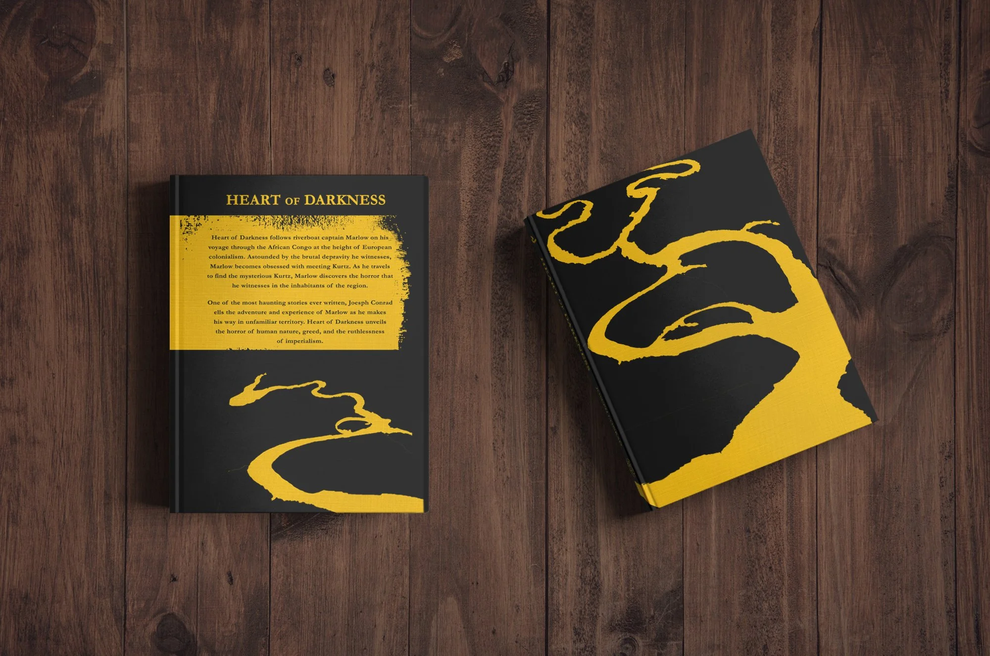
Illustrating Heart of Darkness, a university project
During my time at university, I took the opportunity to illustrate a special edition of Joseph Conrad’s Heart of Darkness as part of a competition for House of Illustration. The brief tasked me with designing a striking book cover and three full-page internal images to accompany the text. This project challenged me to balance the novel’s complex themes with a visual style that felt fresh and modern while respecting the story’s historical and cultural layers.
The images I created are bold and graphic, designed to reimagine Heart of Darkness in a more contemporary context. The intense yellow that dominates the palette reflects the "yellow" of the Congo River as described in the novel, a nod to Marlow and his crew’s unsettling journey. This vivid colour contrasts starkly with deeper, grungier tones, capturing the novel’s darker and more introspective themes.
To complement the narrative’s setting, I drew inspiration from traditional African art and sculpture. These influences informed the shapes, patterns, and textures, adding layers of meaning to each piece. The interplay of these elements helped ground the visuals in the story’s geography while emphasising its timeless relevance.


Each illustration began as a hand-drawn composition, using pens, pencils, and wax crayons or pastels. This hands-on approach allowed me to experiment with raw textures and expressive lines, giving the images a tactile, almost organic quality. Once the drawings were completed, I scanned them into Photoshop to refine and manipulate the elements. This hybrid process allowed me to blend traditional techniques with digital precision, creating a cohesive yet dynamic visual style.


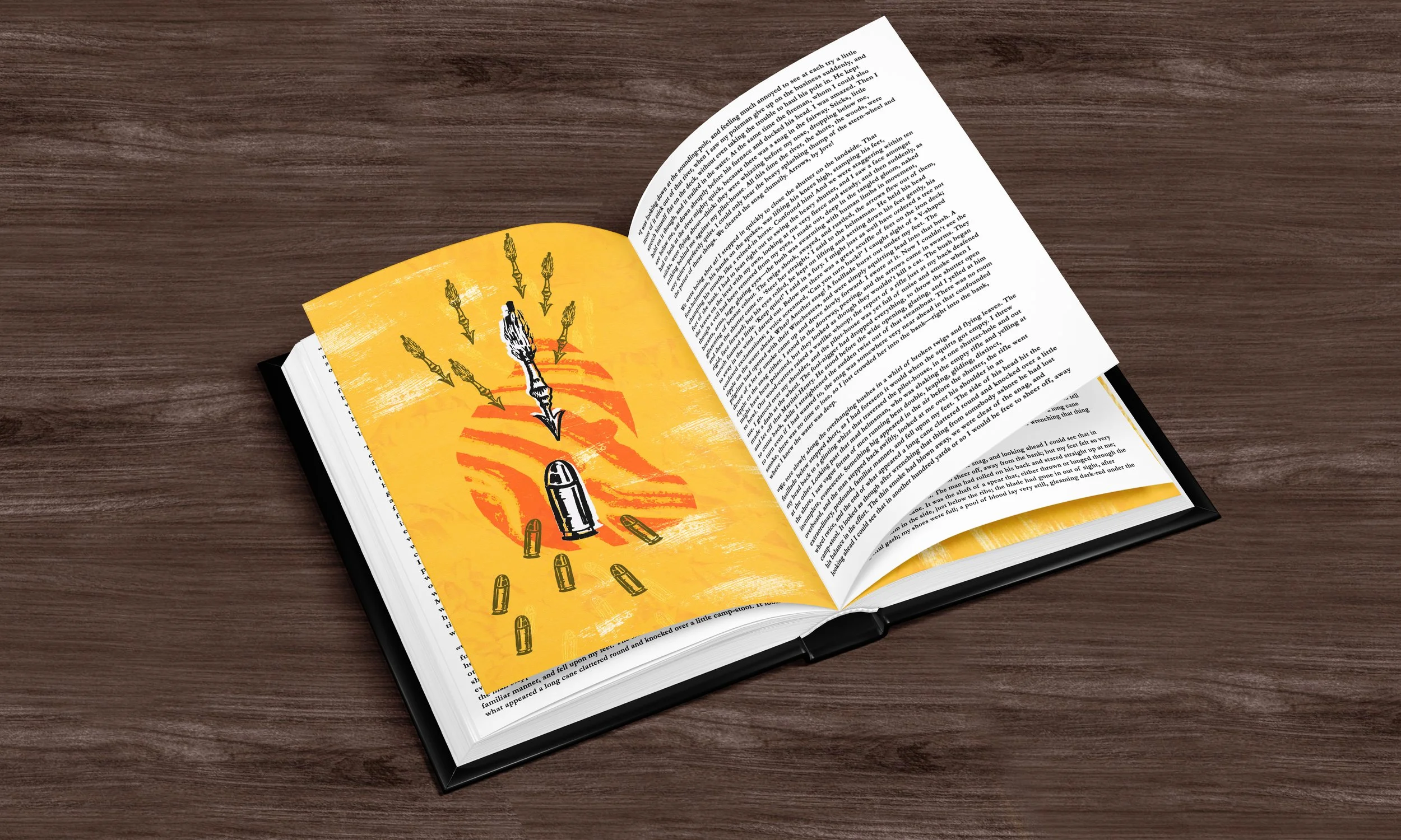
This project was a chance to explore how imagery can shape a reader’s experience of a story. I’m particularly proud of how the textures and grunge-inspired effects subtly hint at the darker undertones of Heart of Darkness without overwhelming the imagery. The final pieces reflect the novel’s intensity while inviting a new audience to engage with its timeless themes.
Working on this special edition was a formative experience. It pushed me to think critically about the interplay between story and design, and how visual elements can both interpret and enhance a narrative. It’s a project that remains close to my heart—not just for its challenges, but for the creative growth it inspired.